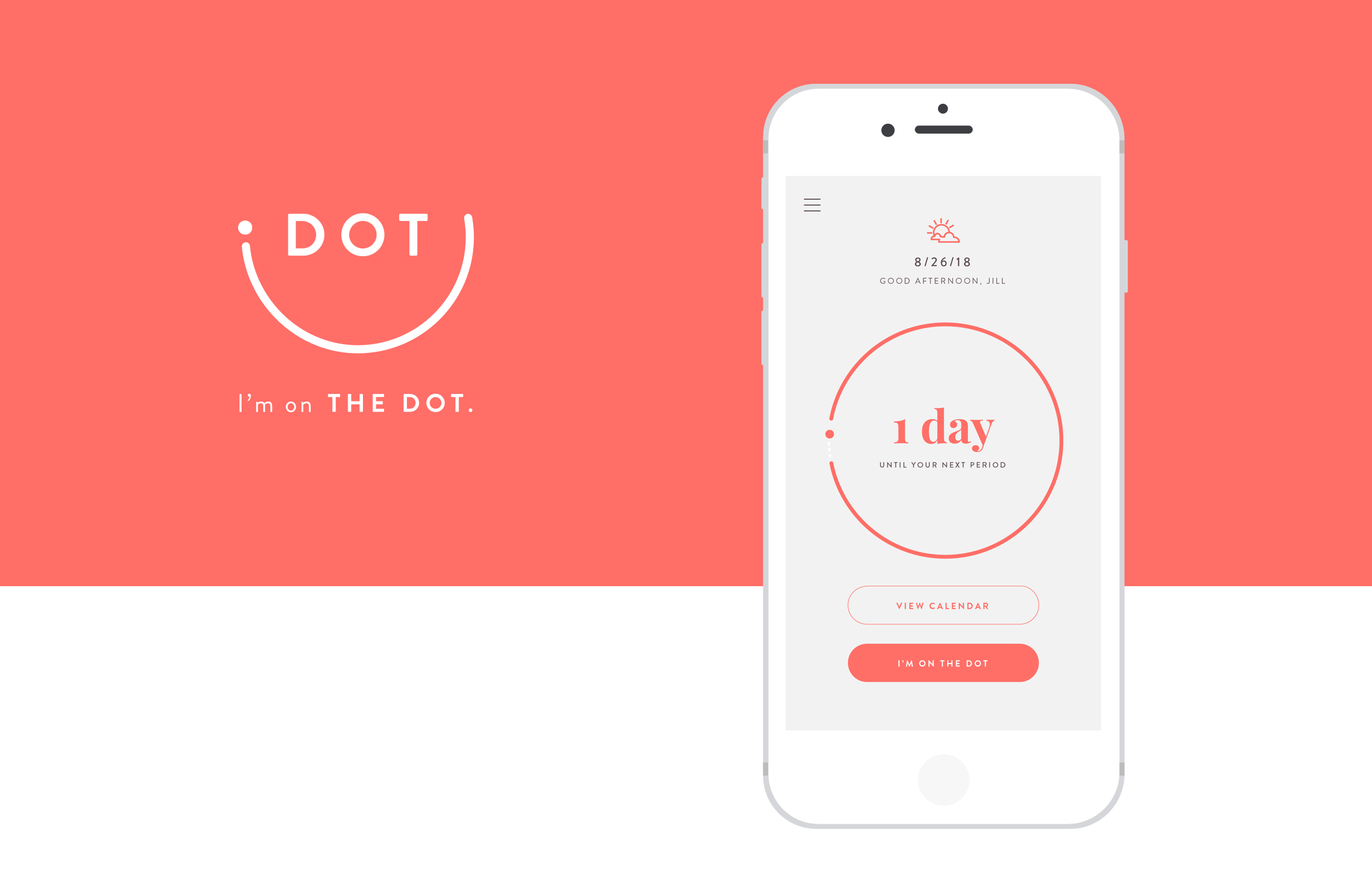
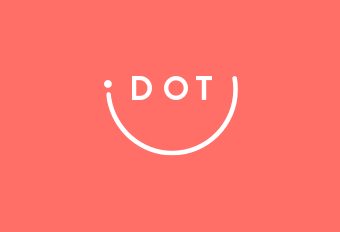
Dot
Concept, logo, branding, product design and overall design direction for a period tracker app.
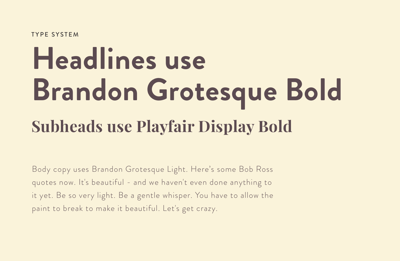
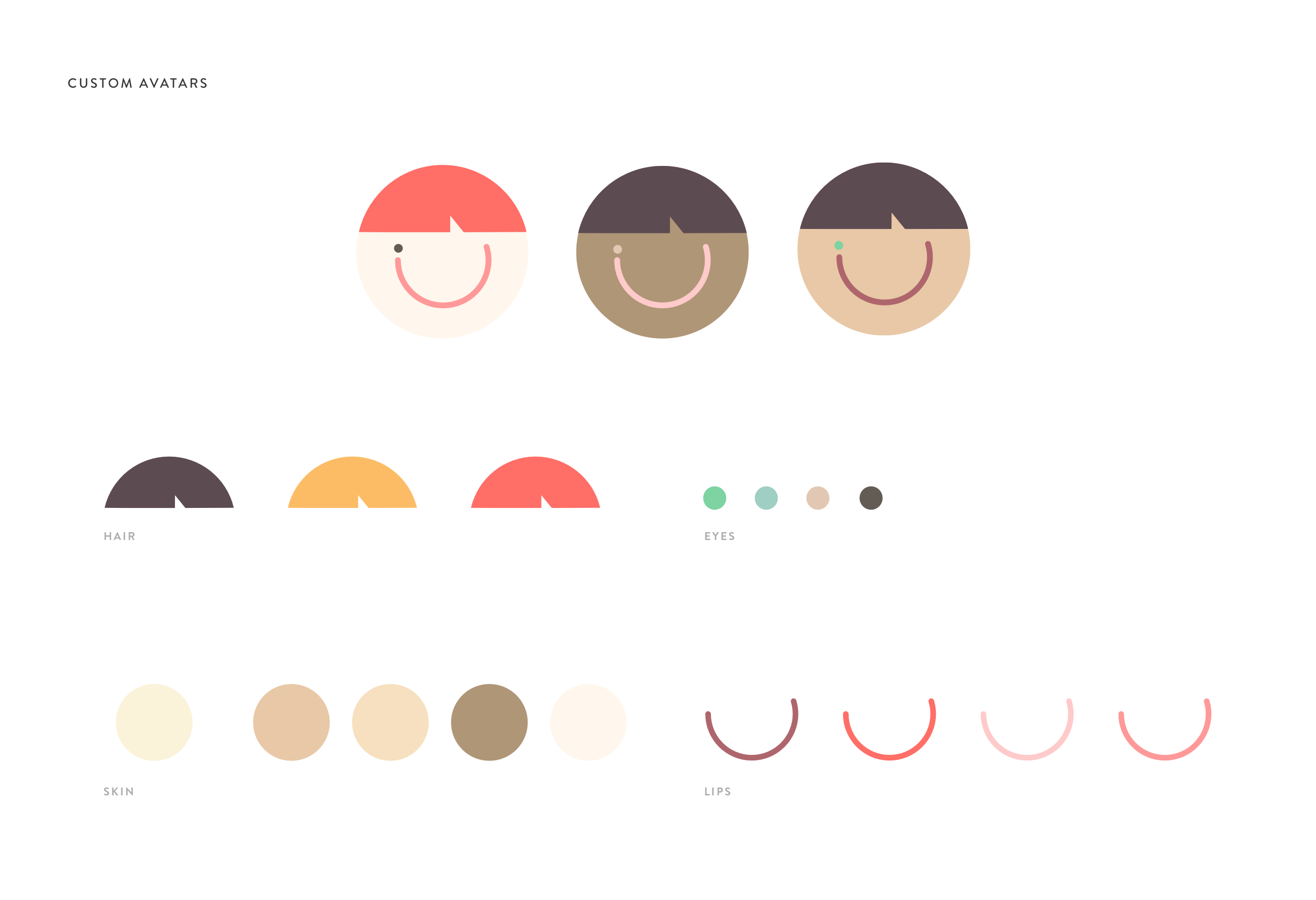
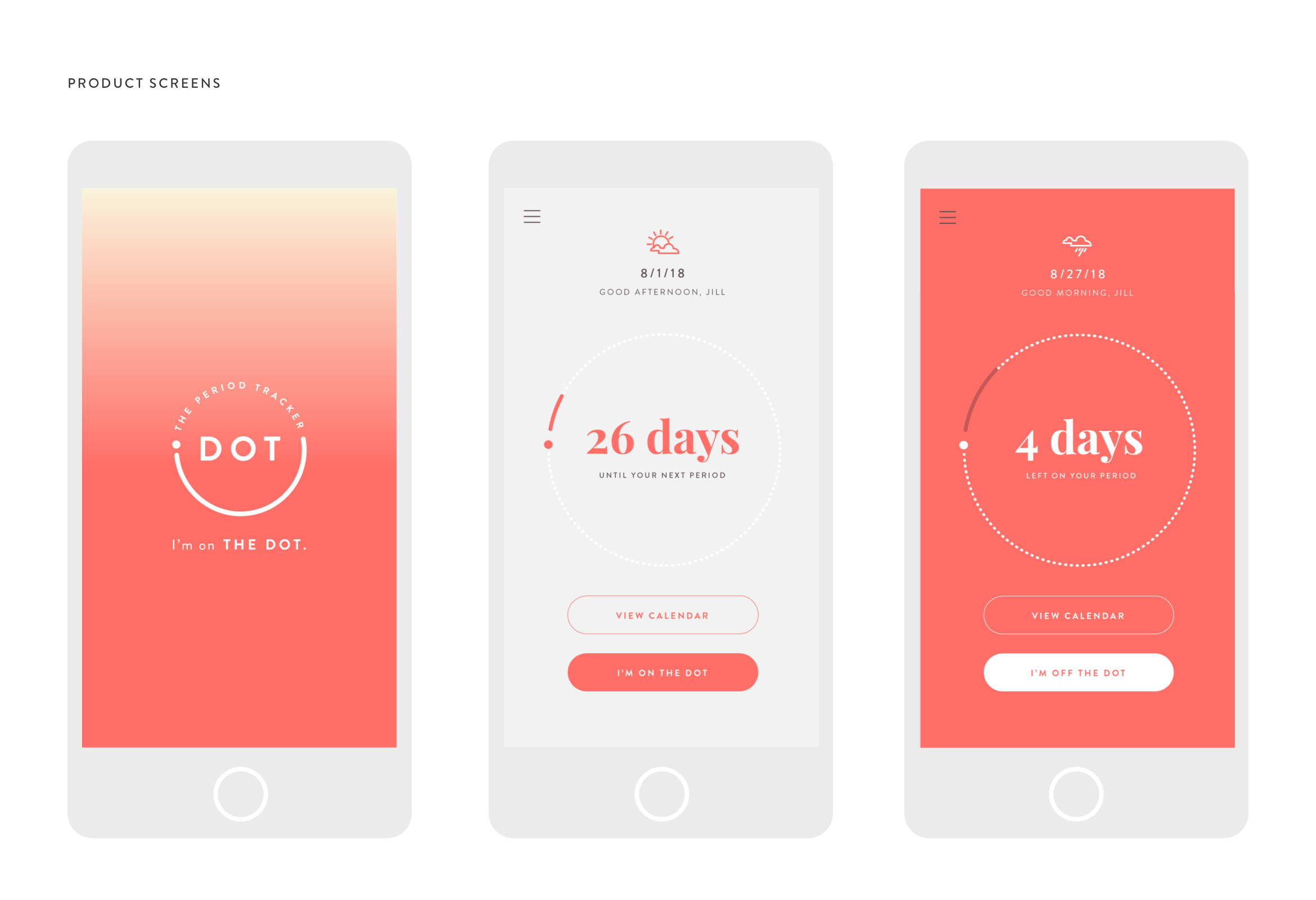
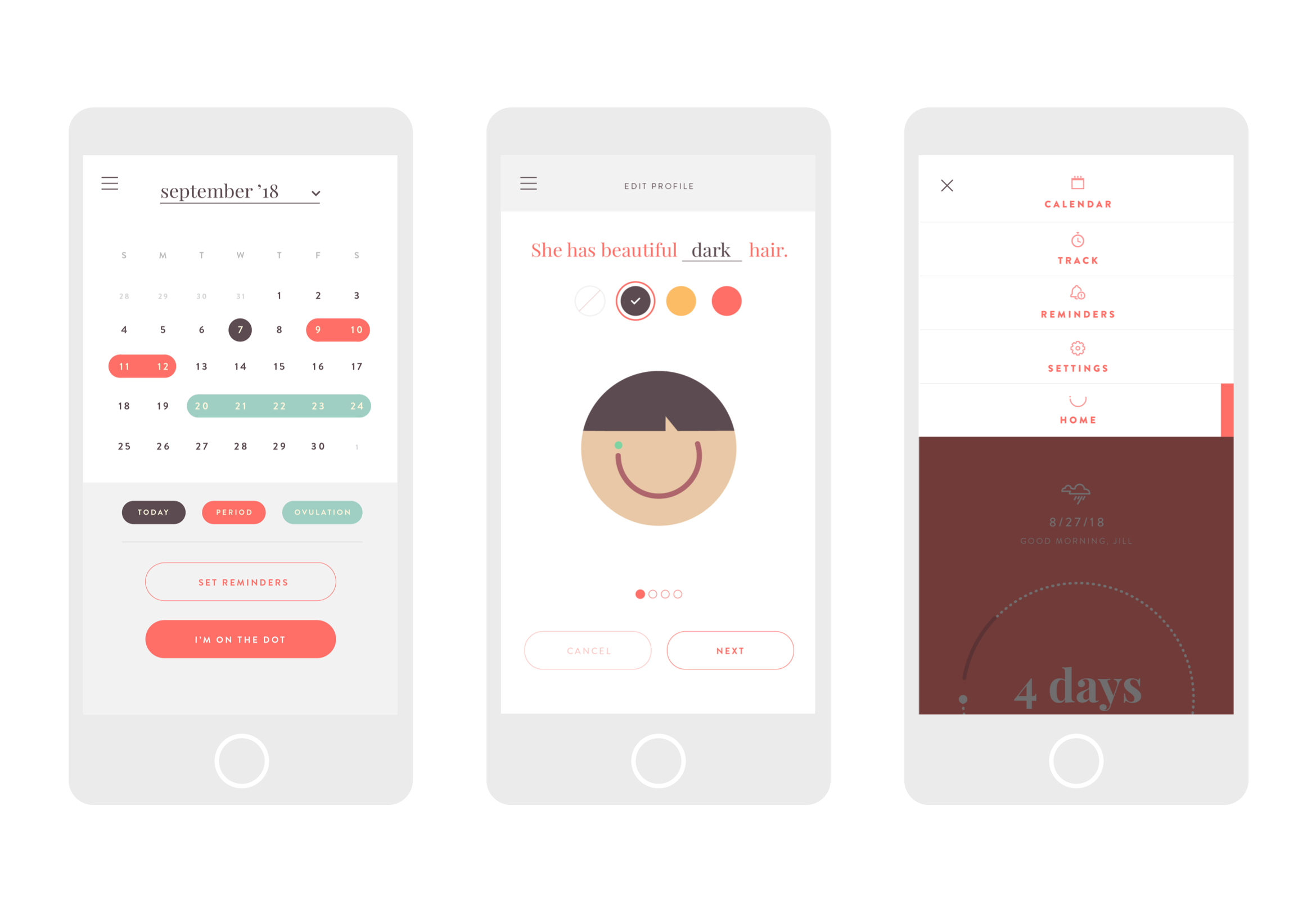
This product is a passion project of mine that I've been wanting to get developed and is still technically a work in progress. I wanted to create a beautiful, well-designed, intuitive and clever period tracker app. The whole idea of the name plays with the idea of the obvious, dot meaning a period, but also plays with the saying "I'm on the dot" – meaning I'm not only on my period (dot) but also I'm on time. The look and feel of this app is meant to be playful and fun, but also useful and functional. So here it is: my period tracker app Dot.
Credit
Agency: Adventure Studio LLC
Role: Creative Director/Designer

See More Work
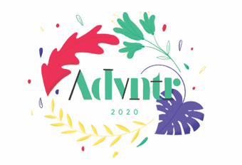
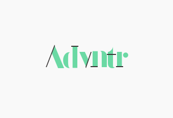
Advntr Calendar '20Print, Illustration
Sensible CareBranding, Website
HyggeBranding, Packaging, Website
YumbleWebsite
GirlbossWebsite
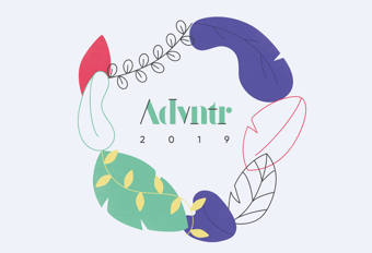
Advntr Calendar '19Print, Illustration
Advntr StudioBranding
DotBranding, Product

Something BlueBranding, Product

FCIBranding, Website
WelfundBranding, Website
Kit KatWebsite

MarcusWebsite
VerizonWebsite